By Charles Morgan and Hubert Walker for CoinWeek Notes …..
Charles Barber’s quarter dollar design was introduced in 1892, a beneficiary of the provision of the Mint Act of 1890, which allowed for the design of a coin to be changed every 25 years. Though not mandated by law, Barber’s designs for the dime, the quarter, and the half dollar were set aside in 1916. Mint Director Robert W. Woolley had invited three renowned sculptors from outside of the United States Mint to produce designs for all three denominations – possibly intending that each coin would display the efforts of a different artist. However, Adolph A. Weinman captured two of the three prizes, one for the dime and another for the half dollar. Hermon A. MacNeil’s design was chosen for the quarter.
MacNeil was a well-known sculptor, particularly of Indian subjects. But he had also produced sketch models for the Word’s Columbian Exposition held in Chicago in 1893, a statue for the William McKinley Memorial in Columbus, Ohio, and sculptures for other public projects.
MacNeil’s design for the quarter was representative of the artistic vigor of the early 20th century, and he joined a select group of artists whose efforts were prominently displayed on coins of the period. The list of those designs includes the Lincoln Cent; the Indian Head (Buffalo) Nickel; the previously mentioned Weinman Winged Liberty Head (Mercury) Dime and Liberty Walking Half Dollar; the incuse Indian Head quarter eagle and half eagle; the Saint-Gaudens Indian Head Eagle $10 and eponymous Double Eagle $20 gold coins; and several commemorative issues, such as the Panama-Pacific Exposition silver and gold pieces.
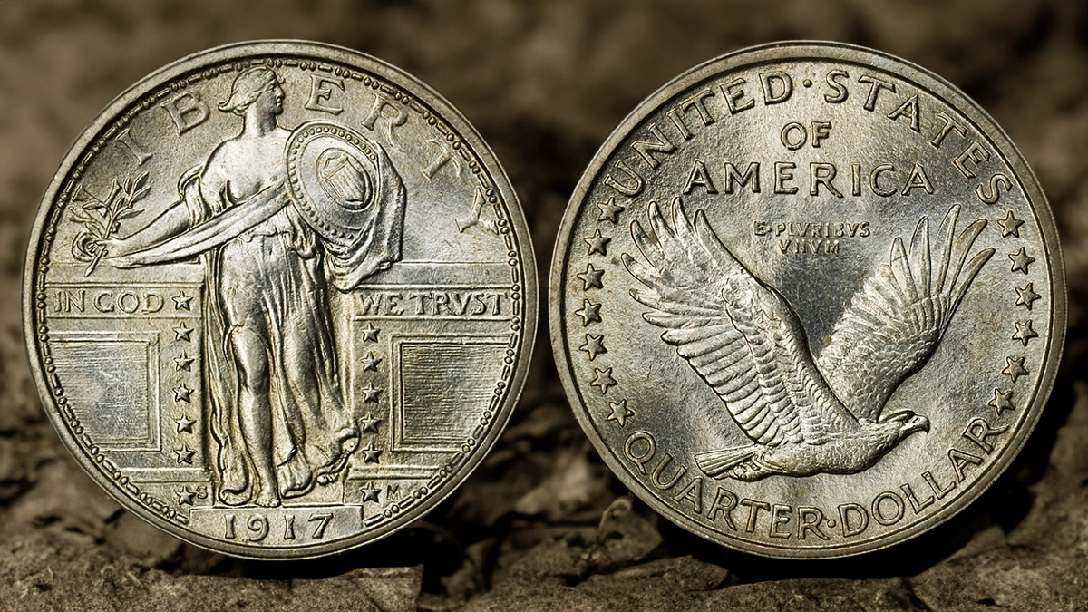
The model for Liberty on the quarter was likely a composite of silent film actor Dora Doscher (also known as Doris Doree) and Broadway actor Irene MacDowell; the latter’s husband apparently disapproved of the pose. The reason for the disapproval was likely the same as that which has been the subject of debate ever since: the partial nudity of Liberty, specifically the undraped right breast.
The 1896 Silver Certificate had a similar display of partial nudity, reportedly causing consternation and disapproval from the ladies of Boston society, which resulted in some bankers refusing to handle the notes. MacNeil’s Liberty was covered up in 1917, remaining so through the end of the series, producing two types of the same basic design. Standing Liberty quarters also include a popular sub-type, that of quarters bearing a “Full Head” classification, which refers to the presence of details in Liberty’s head. Those details include distinguishable leaves in Liberty’s hair, distinct hairline, and evident ear detail. Some authorities suggest that the complete presence of all the rivets in the shield held by Liberty is also indicative of a full strike. However, both head and rivet detail may not be present in the same coin, but only the presence of head detail defines the subtype.
How Much Are Standing Liberty, Type I Quarters Worth?
Several thousand business strike Standing Liberty, Type 1 Quarters have been certified–more for 1917, particularly Philadelphia issues. Hundreds of Full Head examples are listed for each date and mintmark. Reflecting mintage totals, 1916 quarters are the most expensive Type 1 quarter, very expensive as XF40 and finer; Premium Gem and Superb Gem Full Head examples are extremely expensive. Type 1 1917 quarters are modestly priced to MS64 but become increasingly costly in terms of finer grades. Full Head 1917-S Type 1 quarters are expensive finer than MS63.
No Standing Liberty Type 1 Proofs were officially issued; Satin Proofs (possibly Specimens) have been reported for 1917, though none are listed in census/population reports.
In-Depth Standing Liberty Quarter, Type 1 Date Analysis by CoinWeek Notes
Design
Obverse:
The obverse of the Standing Liberty Quarter displays Liberty standing in the opening of a wall or parapet, with her right leg resting on the base and left foot raised as if she is walking forward. Her long, flowing gown drapes loosely and is wrapped around her right arm, falling off the shoulders to expose the right breast. It is partly open at the front (the hem held up by a clasp), displaying the right leg to above the knee. On many coins, Liberty’s navel is clearly visible through the thin material. Her left arm holds a circular shield as if in a defensive posture; the shield displays the Union shield and several concentric rings including a circle of raised dots or rivets near the edge. Liberty’s right arm is extended outward, resting on a portion of the wall, and her hand holds an olive branch. Another loose drapery covers the bottom part of the shield, extends across the front of Liberty, and ends beneath the arm on the top of the wall.
The word LIBERTY arcs across the top of the coin, the “L” partially covered by the olive branch, and “B” and “E” separated by Liberty’s head. Both wall sections display a rectangular panel of horizontal stripes, with IN GOD at the top of the left wall and WE TRUST (the “U” depicted as a “V”) similarly located on the right wall. Thirteen five-pointed stars form two columns along the wall edges next to the opening, seven to the left and six to the right (the top left star follows the “D” in GOD). The step upon which Liberty stands displays the date in raised numerals. The designer’s initial or monogram “M” is to the right of the bottom star in the right column, and for quarters minted in Denver or San Francisco, the “D” or “S” mintmark is located to the right of the bottom star in the left column. Inside the flat rim is a concentric ornamental ring consisting of two raised angular dots alternating with a short raised bar; the ring is broken by the step that displays the date.
Reverse:
The center of the reverse shows an eagle in flight, headed to the right, wings outstretched and raised. Inside the flat rim is a concentric ring of UNITED STATES at the top and the denomination QUARTER DOLLAR at the bottom, with seven five-pointed stars separating UNITED and QUARTER on the left and six five-pointed stars separating STATES and DOLLAR on the right. Centered dots separate the two words of both the legend and the denomination. OF AMERICA, in two lines and of smaller letters, lies below UNITED STATES; below that text is the motto E PLURIBUS UNUM on two lines; E and PLURIBUS are also separated by a center dot.
Edge:
The edge of the Standing Liberty Quarter is reeded.
Coin Specifications
| Standing Liberty Quarter, Type I | |
| Years of Issue: | 1916-17 |
| Mintage (Circulation): | High: 8,740,000 (1917); Low: 52,000 (1916) |
| Mintage (Proof): | None officially known; 1917 Satin Proof or Specimen examples are reported. |
| Alloy: | .900 silver, .100 copper |
| Weight: | 6.25 g |
| Diameter: | 24.3 mm |
| Edge: | Reeded |
| OBV Designer: | Hermon A. MacNeil |
| REV Designer: | Hermon A. MacNeil |
* * *
Additional References
Bowers, Q. David. The Experts Guide to Collecting and Investing in Rare Coins. Whitman Publishing.
–. A Guide Book of United States Type Coins. Whitman Publishing.
Breen, Walter. Walter Breen’s Encyclopedia of U.S. Coins. Doubleday.
Cline, J.H. Standing Liberty Quarters. Zyrus Press.
Guth, Ron, and Jeff Garrett. United States Coinage: A Study by Type. Whitman Publishing.
Taxay, Don. The U.S. Mint and Coinage. Arco Publishing.
Yeoman, R.S., and Jeff Garrett (editor). The Official Red Book: A Guide Book of United States Coins. Whitman Publishing.
* * *


To clarify the coin’s lettering, MacNeil didn’t simply “depict” the letter U as a V. During the ‘teens and twenties of the last century it was very common for artists to use the 24-character Roman alphabet rather than the modern English alphabet when lettering classically-themed designs.
Like the letter Y that acts as both a vowel and a consonant in modern English, V and I also did double duty for the Romans – TRIPLE if you count their use as numerals! The letters U and J for the respective vowel sounds didn’t come into use until the Middle Ages.
A minor “oops”: The Specifications section lists the Years of Issue as 1798-1804 rather than 1916-1917.