By Tyler Rossi for CoinWeek …..
The 50 State Quarter Program, which ran from 1999 through 2008, was a wildly popular circulating commemorative program that introduced a whole generation of new collectors to the hobby we love. Each year of the program saw the release of five new reverse designs, issued in the order that each state entered the Union. Replacing the beloved Heraldic Eagle found on the reverse of the Washington quarter since its debut in 1932 (with the exception of the Bicentennial quarter, an inspiration for this program), the 50 State Quarter reverse designs were supposed to be emblematic of the states they represented and convey something of their cultural, natural, and historic legacy.
But out of 50 coins over 10 years, some were more successful at this than others.
Of course, no list of the 10 worst of anything is going to be truly objective. And “worst” doesn’t necessarily mean bad, either, since in the case of the 50 State Quarters, the modern United States Mint wasn’t going to allow truly bad artwork onto the coinage. Perhaps a state-mandated concept was less than thrilling or throttled by bureaucracy. Or maybe the idea was good, but the execution left something to be desired.
However it happened, here are our picks for the top 10 worst State quarter designs.
1) Michigan (2004)
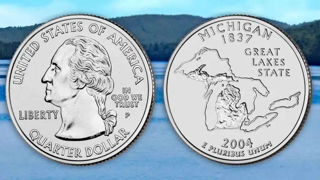
- 26th quarter in the series
- Designer: Unknown. Mint Engraver/Sculptor: Donna Weaver
Coming in at number one on our list is the 2004 Michigan quarter. The coin’s reverse design depicts a simple outline of all the great lakes surrounding a topographical representation of the state. This was chosen from a group of five similar designs, all of which were based on an outline of the state. All other proposed designs submitted to the Mint included elements that showcased the state’s cultural and natural contributions to our nation. While arguably a well laid out design that uses the available space to good effect, the overall look is quite boring. Also, by doing only an outline of the state and lakes, Michigan is implying that they have not given or produced anything of value to the United States.
2) Wyoming (2007)
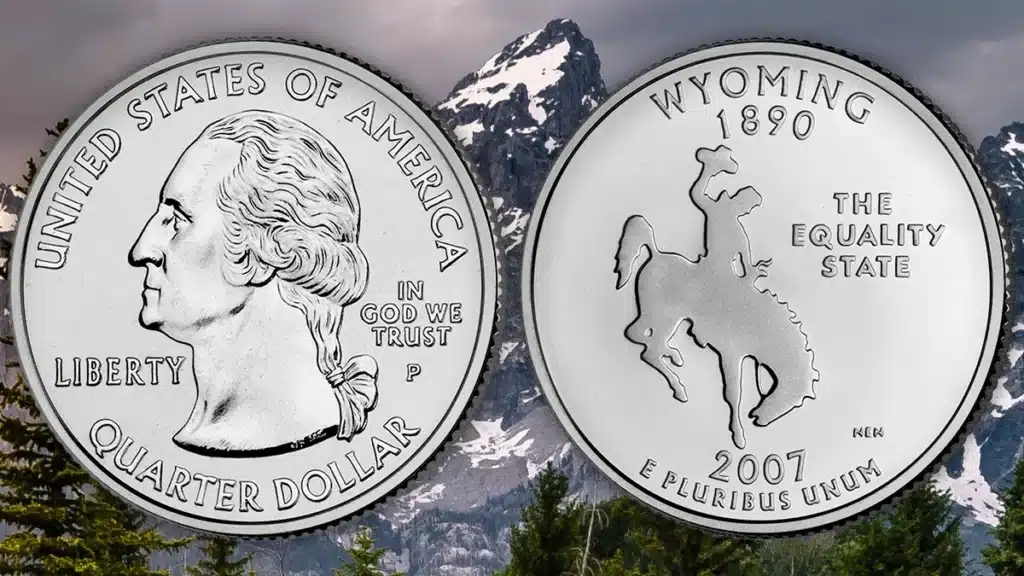
- 44th quarter in the series
- Designer: Donna Weaver. Mint Engraver/Sculptor: Norman E. Nemeth
As one of the most debated 50 State Quarter designs, the 2007 Wyoming quarter has been called ugly and unimaginative. The design consists of a simple cut-out shape of a cowboy riding a bucking bronco. While not certain, this design is believed to be based off of a 1903 photo of cowboy Guy Holt riding a horse named Steamboat. To the right is the state motto “The Equality State”, which it adopted because it was the first state to give women the right to vote. At the time, the federal Commission of Fine Arts (CFA) approved of the design as “powerful,” and the federal Citizens Coinage Advisory Committee (CCAC) stated the design was “authentic.” Nevertheless, once it was released, the general public didn’t like it.
3) Texas (2004)
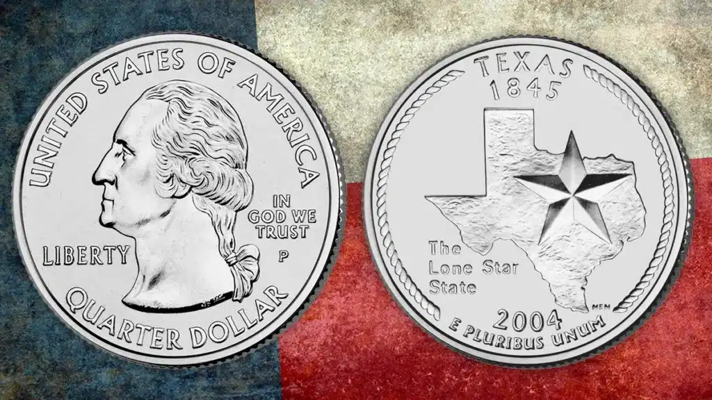
- 28th quarter in the series
- Designer: Daniel Miller. Mint Engraver/Sculptor: Norman E. Nemeth
Next is Texas. For such a large and important state, it’s a shame that they chose such an uninspired design. A simple depiction of the state with a five-pointed star superimposed over it does nothing to promote Texas on a national level. Only the stylized rope lariat border alludes to the “cowboy spirit” of the state.
Most of the early designs were much better; one even included a depiction of the Alamo within the state outline. One would expect that, out of the nearly 2,600 design concepts submitted, the Texas Numismatic Association could have selected a bolder, punchier, design.
4) Florida (2004)
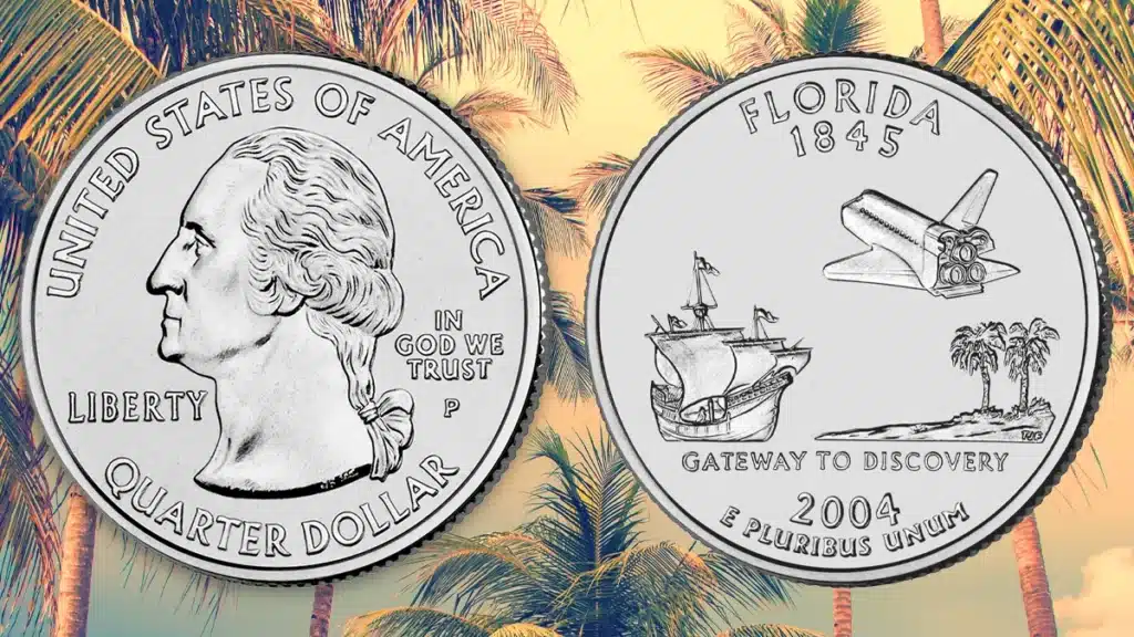
- 27th quarter in the series
- Designer: Ralph Butler (design considerably and adversely edited by the Mint). Mint Engraver/Sculptor: T. James Ferrell
Also released in 2004, the Florida state quarter is a jumbled mishmash of design elements. While each of the three (a Spanish galleon, two Sabal palmetto trees, and a space shuttle) are well rendered individually, they do not unite in a cohesive design. Also, the significant amount of empty field, especially in the center of the coin, is slightly disconcerting.
Earlier design candidates were objectively more beautiful and did a better job promoting the state’s natural and cultural history. Unfortunatly, this was the design chosen in a three-week public vote from between a total of five options: “The Everglades”; “Fishing Capital of the World”; “St. Augustine”; “America’s Spaceport”; and the winning design “Gateway to Discovery”.
5) Massachusetts (2000)
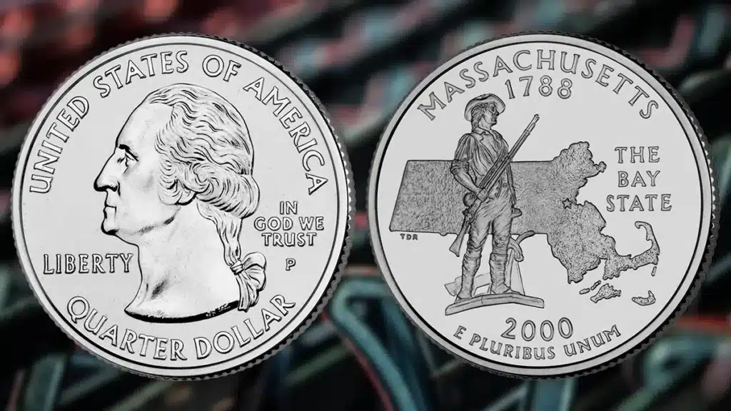
- Sixth quarter in the series
- Designer: Two schoolchildren. Mint Engraver/Sculptor: Thomas D. Rogers
Massachusetts is yet another 50 State quarter that uses an outline as one of the main design elements. Superimposed over this map is a depiction of The Minuteman, a statue that stands in front of The Minuteman National Historical Park in Concord. While this statue does accurately represent Massachusetts’s Revolutionary War history, I have to admit, there were many more appealing ways to convey the message. For example, one of the early design proposals featured a handsome representation of Old Ironsides (USS Constitution) under full sail. Launched in 1797, she is the oldest ship still afloat.
6) Maryland (2000)
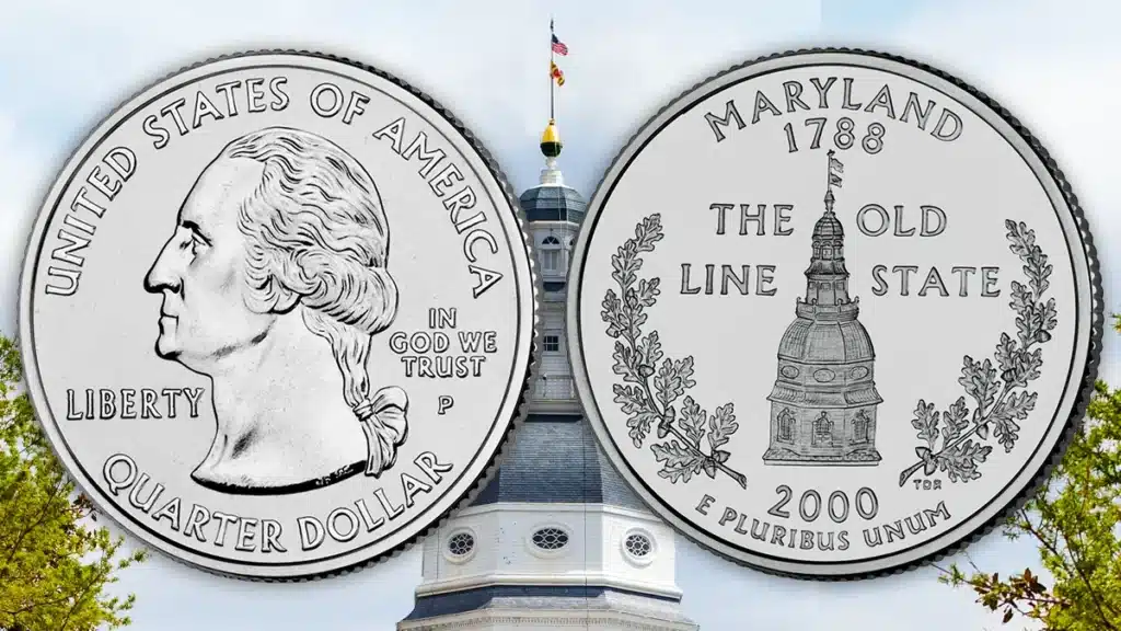
- Seventh quarter in the series
- Designer: Bill Krawczewicz. Mint Engraver/Sculptor:Thomas D. Rogers
Issued in 2000, Maryland chose to depict the statehouse tower on the reverse of its quarter. Not only is this a rather lazy representation of the state but it is also not even a very skillfully rendered depiction of the building in question. The official design is, if anything, too detailed. Interestingly, the draft version of this design, submitted as a proposal, was much more appealing. Additionally, while the oak is the state tree, why use oak branches as the second main design element? There are so many better, more interesting things to include. Overall, not the worst design, but it is one of the weakest when it comes to representing the state.
7) Wisconsin (2004)
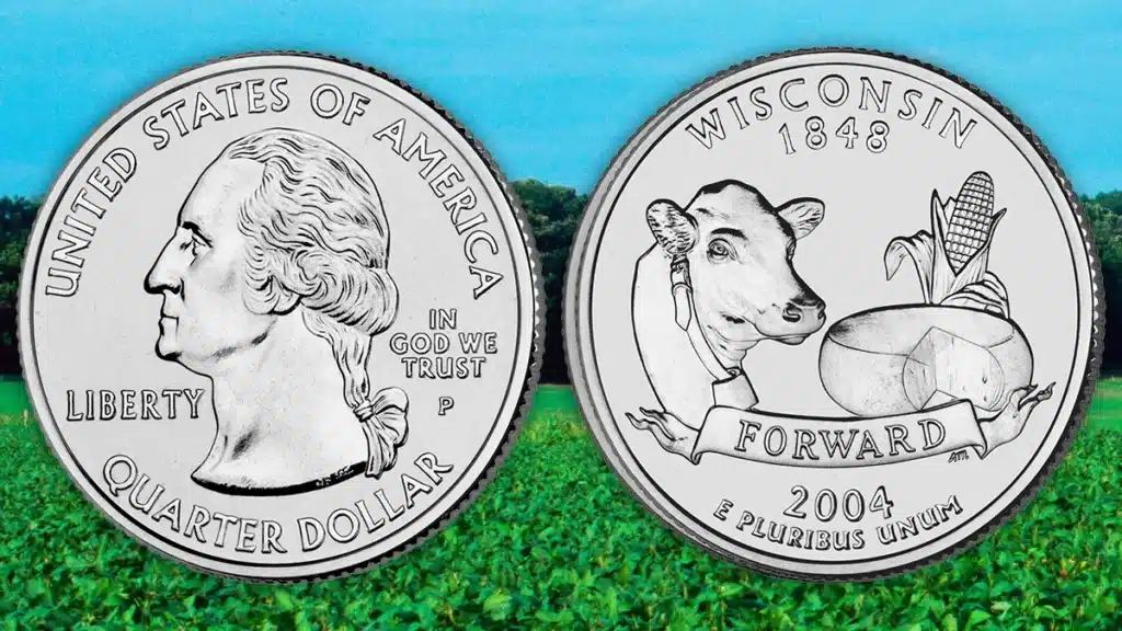
- 30th quarter in the series
- Designer: Rose Marty. Mint Engraver/Sculptor: Alfred Maletsky
While Wisconsin is called the “Dairy State” for good reason, does the state quarter really need to be all about cows and cheese? In a rather slapdash design, the coin depicts the head of a cow, a wheel of cheese, and an ear of corn.
This design was not actually supposed to be used. Instead, then-Governor Jim Doyle (D) scrapped the state panel’s choice: a handsome image of a Native American scout shaking hands with a fur trapper. Panel member Dean Amhaus, president of a Milwaukee-based tourism organization, lamented that this would only spur “more cheese head jokes.”
8) Idaho (2007)
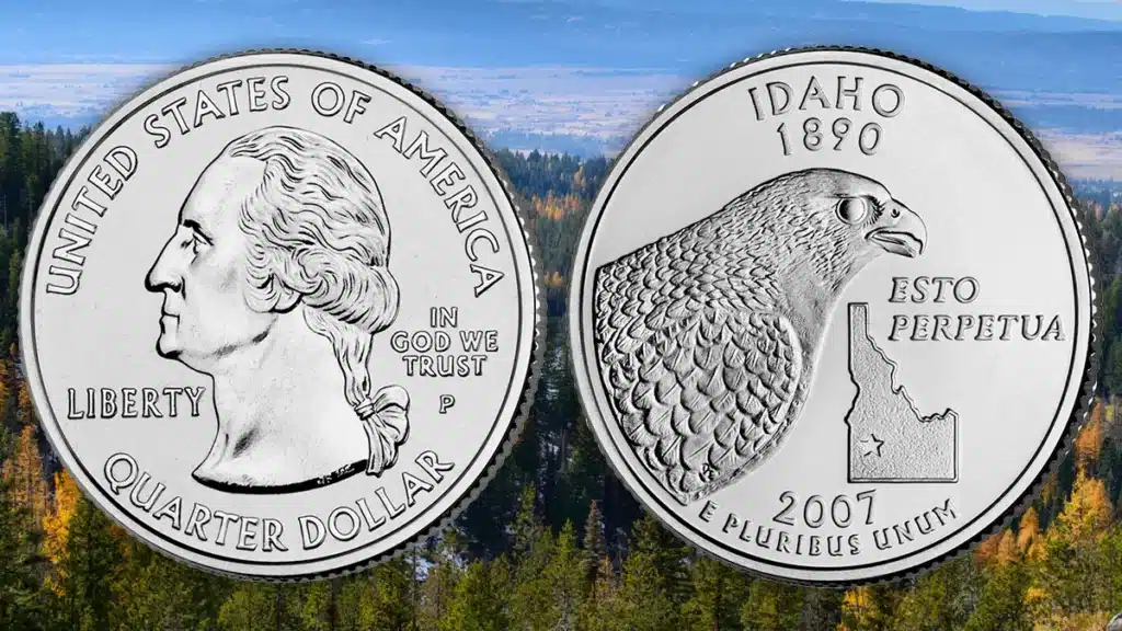
- 43rd quarter in the series
- Designer: Don Everhart
Numismatic designs are all about proportions, and a skillful coin designer can fit almost any image onto the face of the planchet. The 2007 Idaho quarter, however, is not well proportioned. The design is dominated by a massive peregrine falcon ominously standing over a medium-sized outline of the state (again!), disrupting any balance in the composition. If either the state outline or the bird were smaller, it may have worked. As it stands, the outline is overshadowed by the bird, and almost looks to be an afterthought. To make matters worse, the level of detail employed in the falcon’s feathers stands at odds with the state’s outline and the rest of the empty fields. Also, if you squint, the position of the state makes it resemble an outstretched arm holding a gun to the bird’s head.
Earlier design proposals also did not have the best track record. Of the proposals, one even had the lyric “And here we have Idaho, winning her way to fame” taken from the state song.
9) New Mexico (2008)
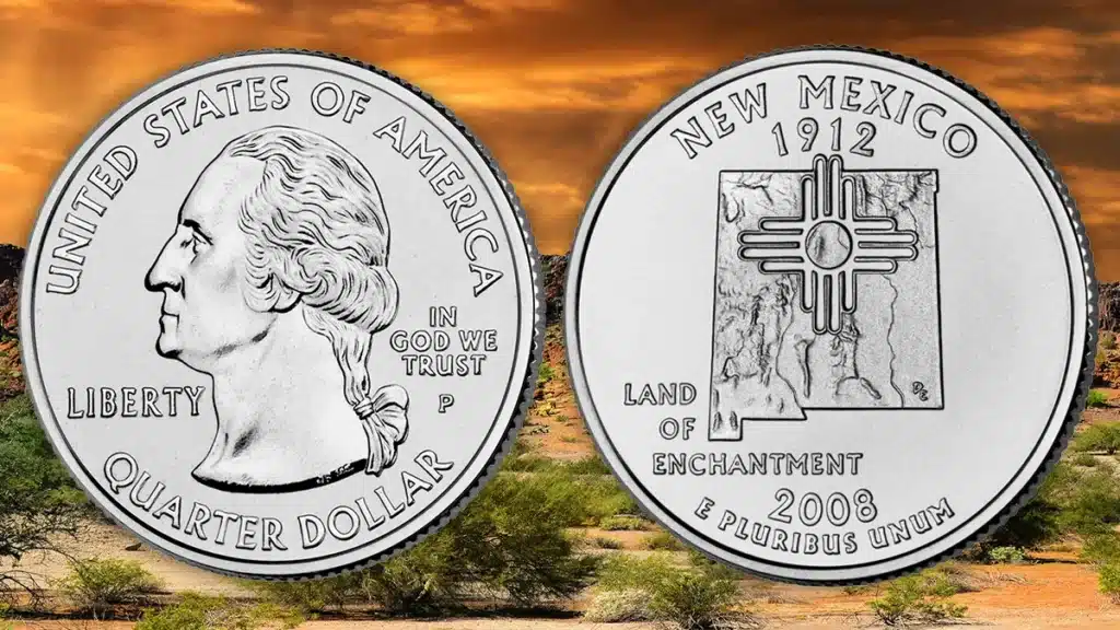
- 47th quarter in the series
- Designer: Don Everhart
Another uninspired design, the 2008 New Mexico 50 State quarter depicts the sacred sun symbol of the Zia people superimposed over a topographical map of the state. It may have been slightly better if instead of being placed off-center right below the state’s founding year (1912), the symbol were centered over the state map. Additionally, the state motto feels rather shoe-horned in at the bottom left of the design. While not outright ugly, the design is definitely uninspired.
Interestingly, unlike the other state quarters on this list, all four New Mexico quarter design finalists were quite similar, playing with a state outline and the Zia sun symbol.
10) Ohio (2002)
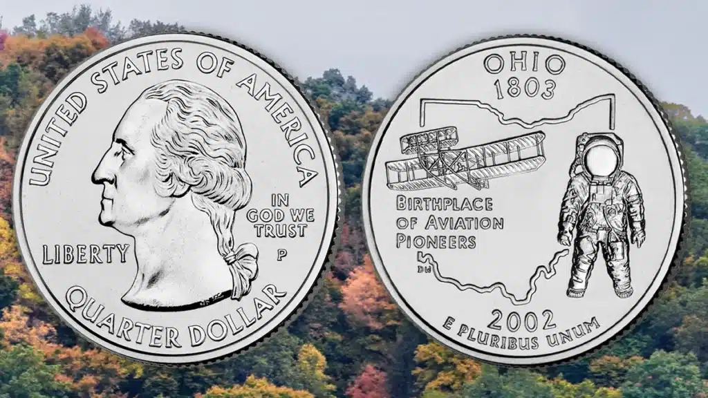
- 17th quarter in the series
- Designer: Unknown. Mint Engraver/Sculptor: Donna Weaver
Lastly, we have the 2002 Ohio state quarter. This design makes much of Ohio’s aviation history. The four major design elements are: the state outline (sigh), an astronaut, the Wright brothers’ plane, and the motto “Birthplace of Aviation Pioneers”. While this claim is true (Neil Armstrong, John Glenn, and Orville Wright were all born in Ohio), it doesn’t make for a good design theme. The reverse feels a bit disjointed, and while there is an overarching theme (aviation), it is not put together well. Like the Florida state quarter above, it’s just a jumble of mismatched elements.
Though it’s kind of cool that the astronaut looks like the old MTV logo.
* * *
So what do you think about the list?
Give us your Worst State Quarter Design in the Comments below. We may add your recommendation to the article.


Interesting comments about Florida coin design. The final design as you stated was by a public vote which was based on, I believe it was 10 or 11 choices sent to Govenor Bush by the State Quarter Committee, in which I was its chairman. I did write an article in FUN Topics about 20 years ago about the entire selection process.
You forgot Oklahoma
I may be wrong but to me, it seems as though the minting of these coins followed after the minting of the Sacajawea dollar coin. In that spirit, the minting of these collectable quarters, should have been limited to National treasures, or historical events.
I disagree that the Michigan Quarter Design is a bad design!!! I think it is appropriate for the State of Michigan.
That is what makes Horse Races. Lots of different opinions. Glad you like it!
I was thinking about the Michigan quarter when I saw the title of this article and look who was number one on the list. The mint def dropped the ball on this one.
I have no issues with any of these designs. While I would appreciate more artistic coins in circulation, I don’t think that was the goal here.
Not a very exciting issue overall.
There have been a few I didn’t care for that aren’t on this list, and a few I liked that are here.
We can thank Michigan’s then Governor for that non inspired design. Regardless of what designs were going to be presented, she had already decided this would win.
Wyoming is the worst by far.
I guess there have to be 10 worst, personally I like Ohio
I never think of coins as ugly, but this list shows some could be better.
mostly dull coins
??? I love the Massachusetts design!!!!
It is subjective, but I vote for Ohio, it looks like the astronaut is being hung by a rope!
I have family in New Mexico. Liked the design of the quarter. It is a beautiful state, and the coin matched the area. Great place to visit.
Manny is the designs leave something to be desired. Wasted space or maybe a lack of creativity. It is my opinion that the blank space is worse. I do like the cute cow on Wisconsin’s quarter in fact I think it is fitting for them My home state quarter has a salmon , Mt Rainier and trees. Pretty much what we are associated with . And isn’t that kinda the point with a state quarter?
Wisconsin error coins were quite valuable.
certainly everyone will have a different opinion on this subject
These aren’t that bad
Florida and Space Shuttle is one of my favorites.
i agree with most of this list. PA should on it though.
The Michigan quarter looks like a dinosaur spitting and a blob landing below it.
I think the picks were appropiate.
I don’t think many of these are that bad. Sure, sone are lazy, but I imagine it is hard to make something readable on a coin that size.
How embarrassing. This is not a surprise in many cases. I would ask for a redo is at all possible. I was saving them back then and missed only one at the time. Fun.
Florida’s quarter is too disjointed probably belonged at #1
interesting facts
Tyler Rossi is an idiot
Agree these are the 10 worst designs
Haha! Nice…
Still nice.
Wyoming’s horse is admittedly grade school quality. At least Idaho has a bird…
As a Michigander, I agree with the choice of the reverse. On the other hand, I have always thought that the New Mexico obverse was one of the better looking ones. To each his own.
The reverse of Michigan’s looks like a reject Rorschach ink blot! lol
The Ohio coin and the MTV logo! I can’t unsee that! Thank you for the chuckle.
Interesting article on the 10 worst state quarter designs.
agreed
It is true that several of the quarters mentioned have a bland presentation of the contribution of their citizenry. I do like the Ohio quarter though.
You know you are in Wyoming because of that design. We like it. Thanks.
as a Texan I’m surprised The Alamo wasn’t picked to represent our state
Agree Texas should have gone with the Alamo, but keep yer mitts off Ohio (born a Buckeye).
Maybe there is a curse on the letter “W”. Both Wyoming and Wisconsin are poor examples to my eyes.
Texas and Florida are both pretty boring
California not much better
Likewise California
To each “state” their own.. paraphrasing a saying. I will not judge their reasons for designs but, believe many missed an opportunity. Much as some states have done reference their flags.
The Florida spacesuit looks like an old-fashioned diver’s suit because of the state outline connecting to it like an air hose. I find most of the state quarters to be too ornate and detailed. There are times when simplicity is best.
Some of them are good. I like New Mexico.
It’s good to know Minnesota is not on the list!
only IF the quarters contained silver
Hopefully quarters wont go the way of the penny
My favorite is the oak tree on the Connecticut quarter.
I’m from Wisconsin and I agree the quarter design could have been better but it still gives you a Wisconsin feel.
I enjoyed then all!
Great read about these state coins!
As cluttered as a lot of these designs are, they are still much better than what’s has followed in the women in history designs are. So cluttered that you can’t even figure out who the heck is actually being honored.
Yes. ALL of the modern quarter series are TRASH!!!
Wyoming is the only one that always stands out to me as a bad design. The flat silhouette makes a simple design feel like an unfinished prototype or a quick sketch of what it could be. It also shows wear poorly because it’s so smooth and featureless.
Yes all the designs are not what you would expect and really doesn’t seem to do each state justice.
Good thing the article was limited to ten.
Although there is corn in Wisconsin, it is much better suited for Nebraska. Instead, that corn should have been a beer and brat. Obviously, whoever designed it must not be from there because it’s not exactly a secret that Milwaukee is also dubbed “beer capital of the world”. Even a sports team “BREWers”… and they surely weren’t named for making coffee.
Still, it is not as bad as some of those designs.
I generally dislike state quarter designs. They were picked too hastily and are not very innovative! They also overloaded the collector market with a ton of different quarters.
Some of these designs are pretty creative… In a strange way though!
Despite what some say, I really like the Massachusetts state quarter design!
Very interesting article. Never knew there was such a list.
My mom collected state quarters and it got me into the field of errors and varieties.
I actually liked the Statehood Quarter series. While some of the designs may not have been the most glamorous, they each represented their states well. Now, the designs that have followed….that’s another story.
I had a book that allowed you to insert a quarter from each state (one front and one back). I tried to collect as many as I could. I probably lost interest and missed the last couple of years. It was a nice concept, but more of a gimmick than a collector item.
I agree with this list.